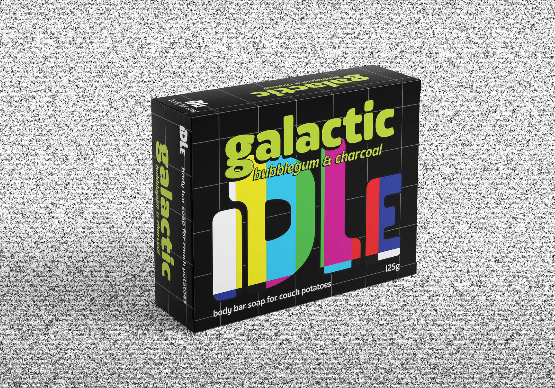
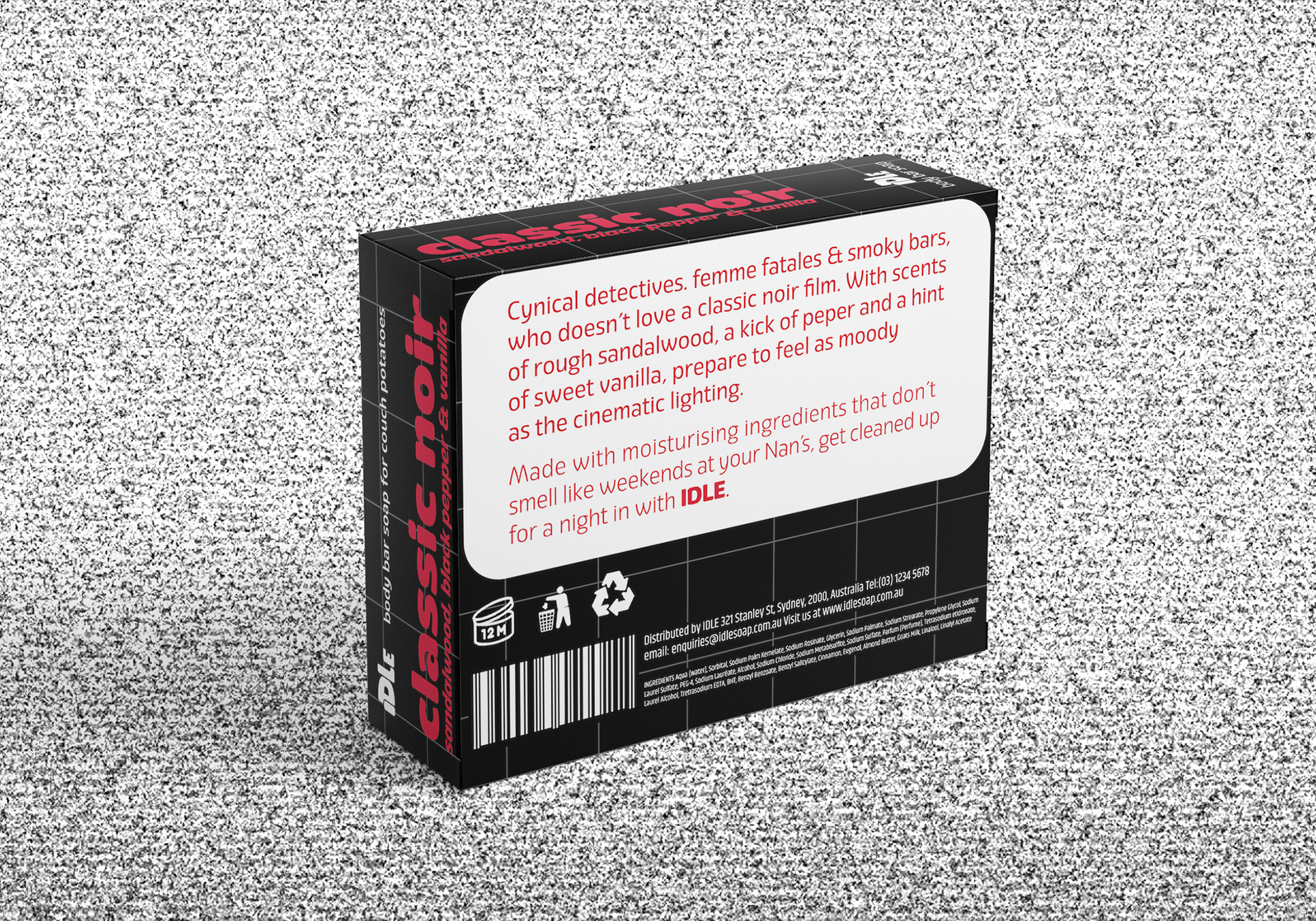
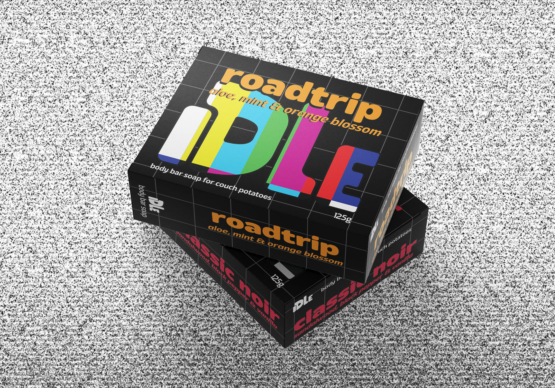
A challenge was issued to create packaging design for an unusual product/demographic audience pairing. And so IDLE was born - body bar soap for couch potatoes. The design overall is based on the tv screen test - specifically the black background, grey lines and rainbow colours used for the logo. The logo itself is drawn in the shape of a couch and as such has a round pillowy look. This then went on to influence other typographic choices in the design to have an inflated, soft appearance.


